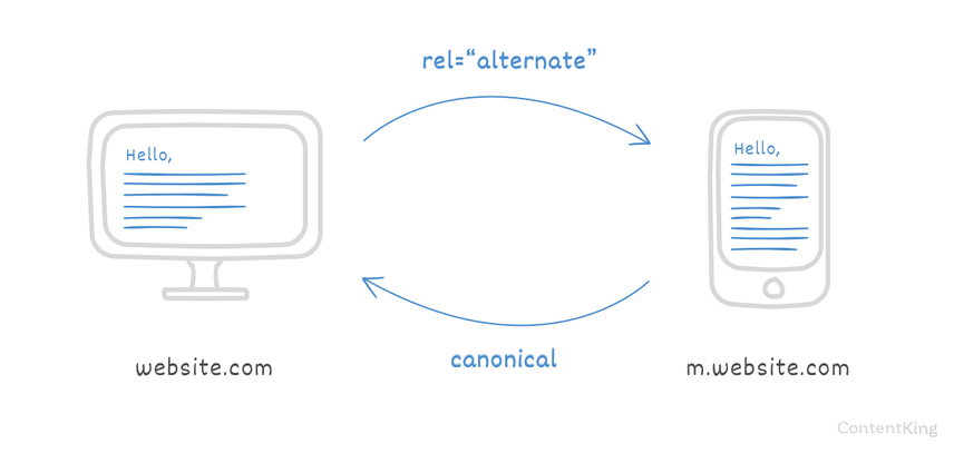
rel="alternate" mobile attribute
When you have separate mobile and desktop websites you need to make the relation between these two clear to search engines, to help them understand which website to serve to their users and to prevent duplicate content issues (https://www.contentkingapp.com/academy/duplicate-content/).
Make sure to keep the following best-practices in mind when implementing this attribute:
- Bidirectional references using the mobile attribute from desktop to mobile and the canonical link from mobile to desktop.
- One-to-one relations: every desktop page has one mobile counterpart and vice versa.
- Avoid redirects: reference only actual pages.
- Use absolute URLs including the domain name and protocol.
What is rel="alternate" mobile?
When people talk about rel="alternate" mobile, rel="alternate" media tag or rel="alternate" media attribute, they refer to this link relation:
<link rel="alternate" media="only screen and (max-width: 640px)" href="http://m.example.com/">
For the sake of ease, we'll call it the mobile attribute here on out.
This link relation is used to indicate a relation between a desktop and a mobile website to search engines. If you have a separate desktop and mobile website, and you care about mobile SEO you need to be using the mobile attribute. Currently only Google and Yandex support the use of the mobile attribute.
When should I use the mobile attribute?
If a sizable percentage of your visitors is coming from mobile devices it may make sense to optimize their experience with a dedicated mobile website. Note that this is different from having a "responsive website", With a responsive website there's a single website with a layout that adjusts itself to the device it's shown on, whereas with a dedicated mobile website there's a fully separate website on its own URL.
In this case, where you have separate desktop and mobile websites you want search engines to show the right version of the website to the right user. When users on a desktop are using search engines and your website comes up you want them to end up on your desktop website. If they're on a mobile device, you want search engines to show your mobile website.
How to implement the mobile attribute

The mobile attribute can be implemented in the HTML or through the XML sitemap.
Implementation in HTML
On the desktop page In the HTML of the desktop page, use the link relation definition to point to the mobile version of the page:
<link rel="alternate" media="only screen and (max-width: 640px)" href="http://m.example.com/">
This means that the mobile website should be served when the width of the user's device is less than 640 pixels.
On the mobile page In the HTML of the mobile page, point to the desktop version of the page using the canonical URL:
<link rel="canonical" href="http://www.example.com/">
Having the canonical URL there prevents duplicate contentDuplicate Content
Duplicate content refers to several websites with the same or very similar content.
Learn more. It tells search engines the desktop page should be indexed.
Implementation through XML sitemap
Google also supports the mobile attribute definition through XML sitemaps.
<?xml version="1.0" encoding="UTF-8"?>
<urlset xmlns="http://www.sitemaps.org/schemas/sitemap/0.9" xmlns:xhtml="http://www.w3.org/1999/xhtml">
    <url>
        <loc>http://www.example.com/</loc>
        <xhtml:link rel="alternate" media="only screen and (max-width: 640px)" href="http://m.example.com/" />
    </url>
</urlset>
Please note that it's still required to have the canonical URL on the mobile page, pointing to the desktop page.
Best practices for mobile attribute
Bidirectional references
In order for search engines to understand the relation between the desktop and mobile pages, the desktop page needs to have the mobile attribute and the mobile page "confirms" the relationship using the canonical URL.
One-to-one relations
Each desktop page should only have one mobile counterpart and vice versa.
Avoid redirects
Avoid having rel=alternate mobile and rel=canonical tags that point to URLs that in turn redirect to other pages. This is confusing for search engines.
Use absolute URLs
Even though it's not against the specification of the link tag, the general consensus is not to use relative URLs when defining mobile attribute. Relative URLs are more likely to be interpreted wrong by search engines. The same best practice applies to other uses of the link tag: canonical URL, hreflang attribute and pagination attributes.
Test mobile friendliness
Use Google's Mobile Friendly tool to test the mobile friendliness of your website.
Frequently asked questions about mobile attribute
1. Why do search engines ignore my mobile attribute?
The mobile attribute is a signal rather than a directive. Search engines are not required to follow your definition of the mobile attribute, but they usually do.
2. I have a responsive website. Do I need to use the mobile attribute too?
No, if you have a responsive website you don't need to use the mobile attribute. The mobile attribute is only meant to be used when you have a separate desktop and mobile website on different URLs.
3. I'm serving different content on my desktop and mobile pages. Is that a problem?
Search engines are still desktop oriented, so your desktop website is leading when search engines determine your website's relevance for search queries. However, Google has announced this will change somewhere in 2018 for them: your mobile website will be leading. Search engines call this a "mobile-first index".
Contrary to popular belief, mobile users often don't want less content and less features so it makes sense to just offer them the same, but using a mobile optimized experience.


